Replenium MSI: Subscription Commerce, 0 to 2.0
I built Replenium's subscription management widget from scratch, shipped it, then redesigned it. I also built the CSS theming architecture that cut partner integration from 3 months to 3 weeks.
The MSI was a subscription management widget embedded directly in partner grocery e-commerce sites. I designed 1.0 (shipped June 2019), iterated it into a complete 2.0 redesign addressing every production failure, and designed the CSS theming architecture that let one codebase serve multiple brand identities without fragmentation.
Designing for three principals simultaneously: end users, retail partners with specific brand requirements, and the development team maintaining a single codebase. Bootstrap collapsed when embedded in partner sites, which meant 2.0 required rebuilding the entire CSS architecture on Grid and BEM from scratch.
2.0 shipped for Albertsons/Safeway and Woodman's. The theming system became the foundation of Replenium's entire product, reducing partner integration time from 3 months to 3 weeks across Albertsons/Safeway, Burt's Bees, and Woodman's Markets.
How can users subscribe to items they use regularly from stores they shop at regularly?
Replenium was building the answer: a widget embedded directly into partner e-commerce sites, in a market where almost no one else was attempting to automate grocery shopping at this level. In the beginning, there wasn't a lot of competitive reference to work from. Order Groove was the biggest competitor; Amazon was a factor but targeting a different market. ReCharge and ReCurly came later. No one was setting out to automate grocery shopping in the way Replenium was.
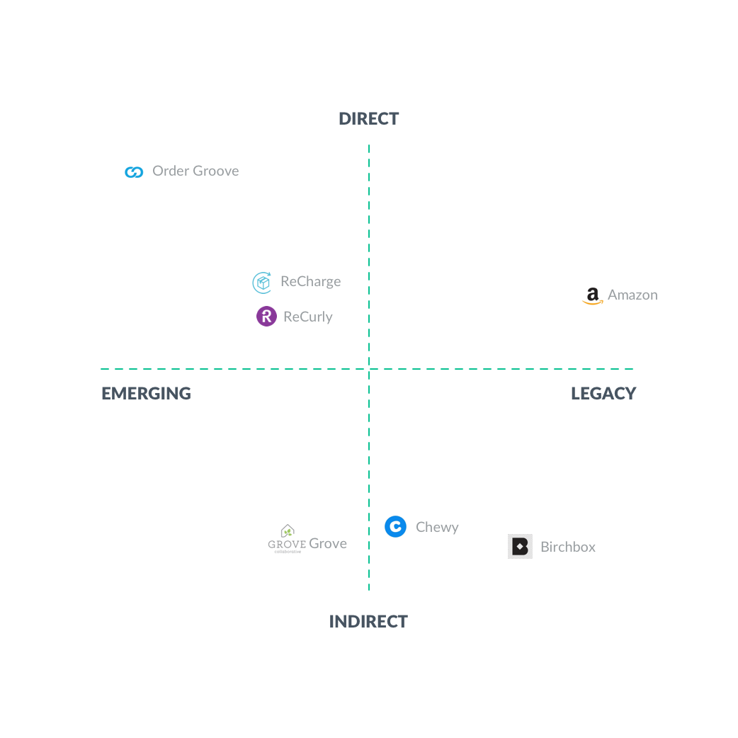 Competitive landscape — Order Groove, Amazon, ReCharge, ReCurly
Before 1.0 launched, I had a handful of user interviews and not much else. The UX reflected that. It was clunky in places, and I knew it. Our first partner liked it enough to go live anyway, so we did.
The most useful feedback came from production. Bootstrap's CSS conflicts showed up immediately in partner environments. The theming system worked immediately. Both of those answers shaped everything that went into 2.0.
I chose Bootstrap because our dev lead was comfortable in it. The CTO had an existing visual direction from a current partner, and I iterated from there. The design was mobile-first, primarily deployed on web.
One thing I'm still proud of is how well the themes blended into the partner sites. Most users didn't realize the widget was a third-party tool living inside the page. Bootstrap was a disaster in almost every other respect, but the theming approach worked.
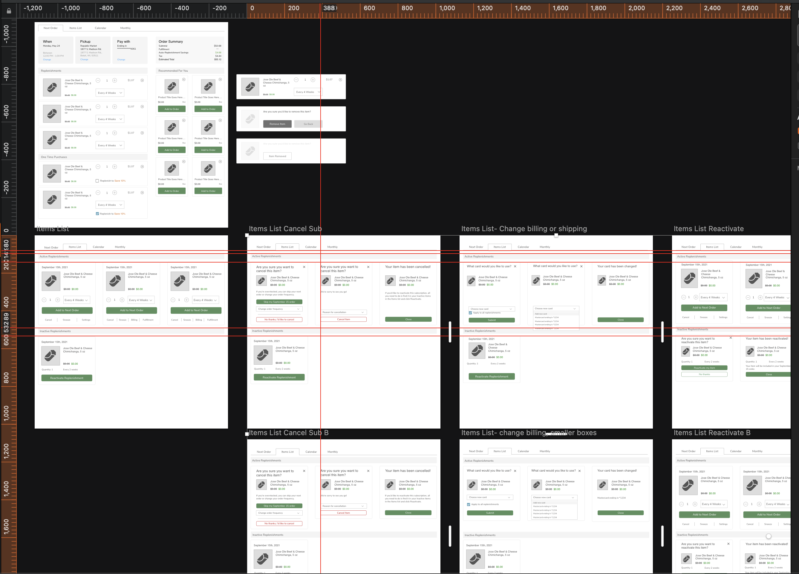
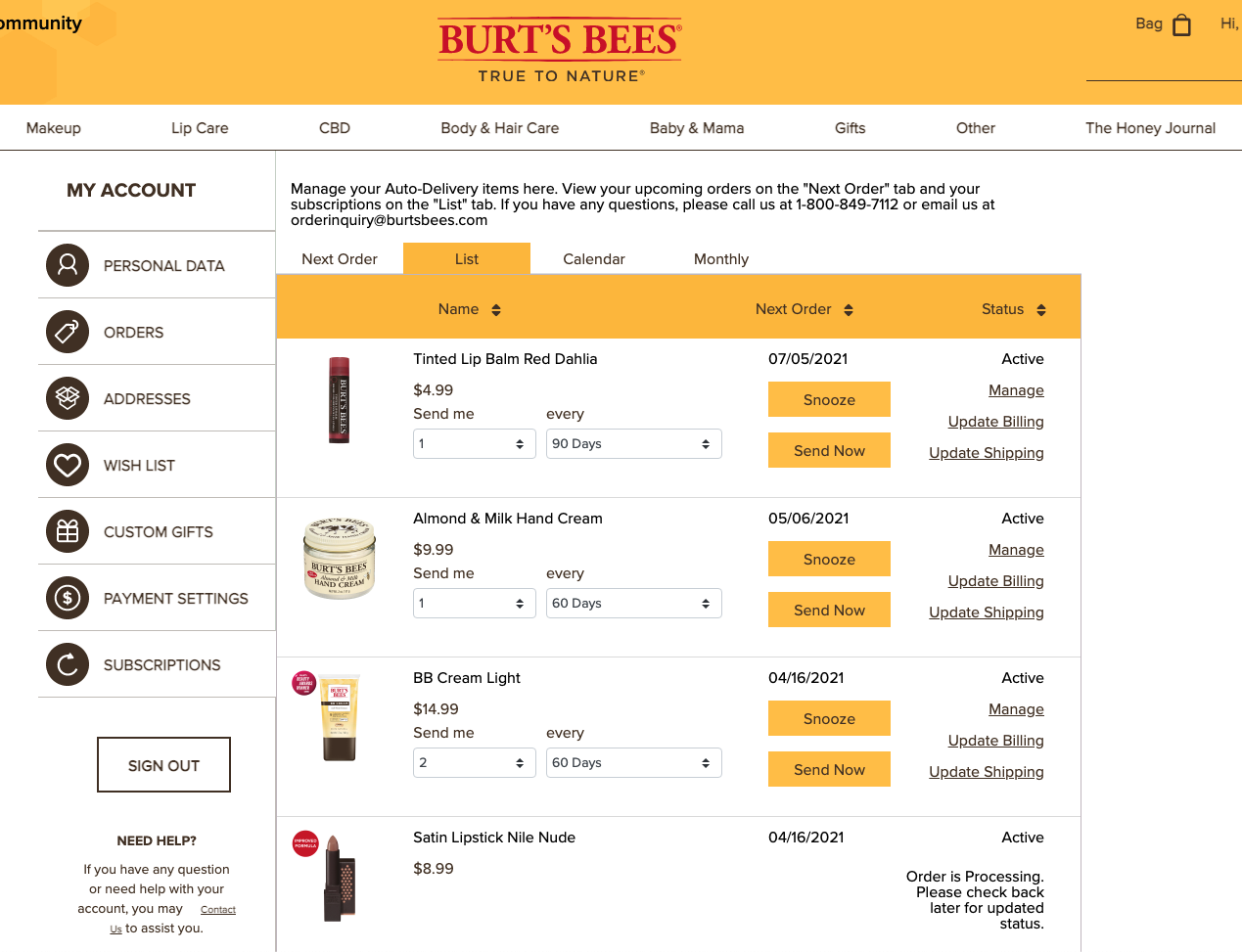 1.0 Items list — all active subscriptions
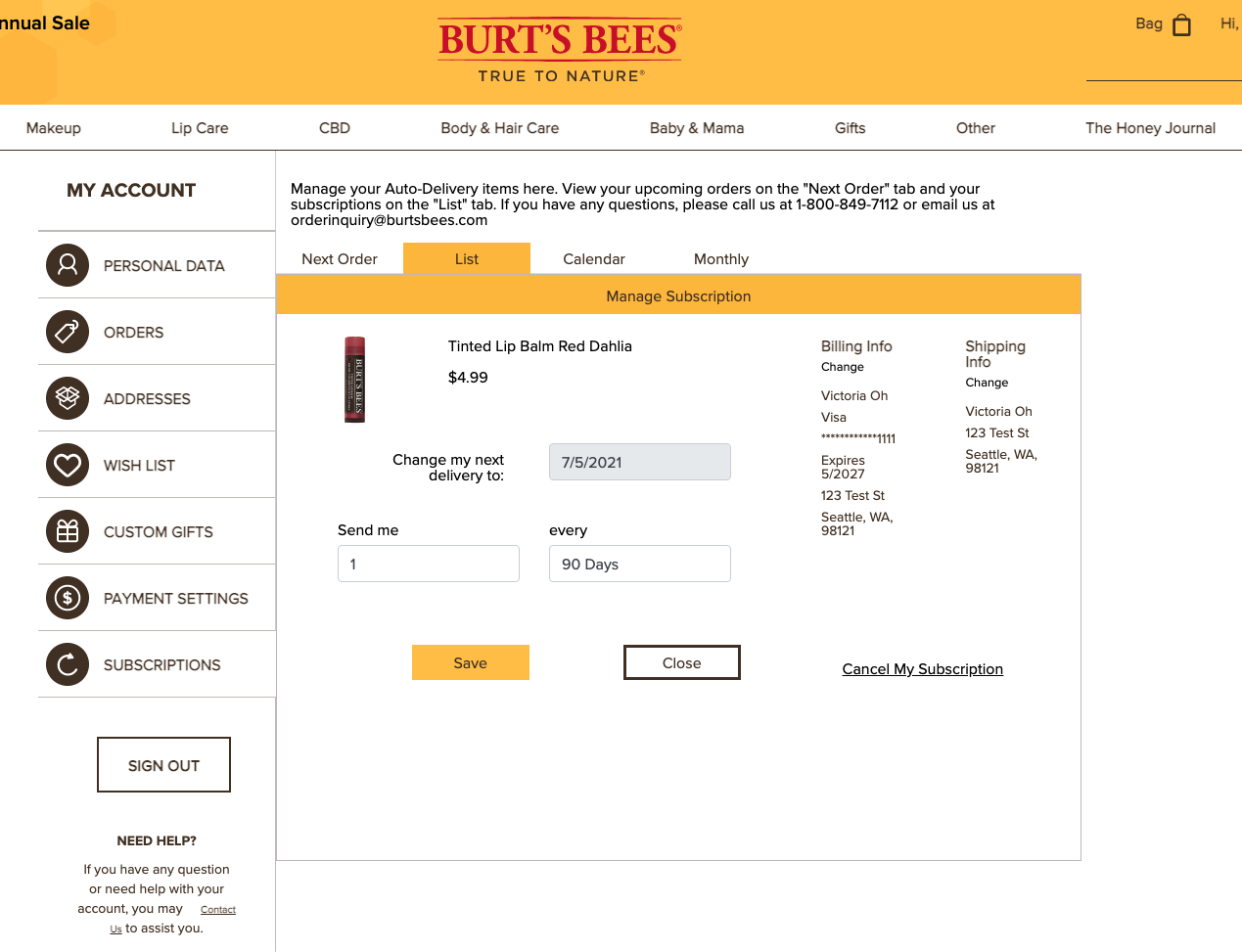 1.0 Manage item — frequency and quantity controls
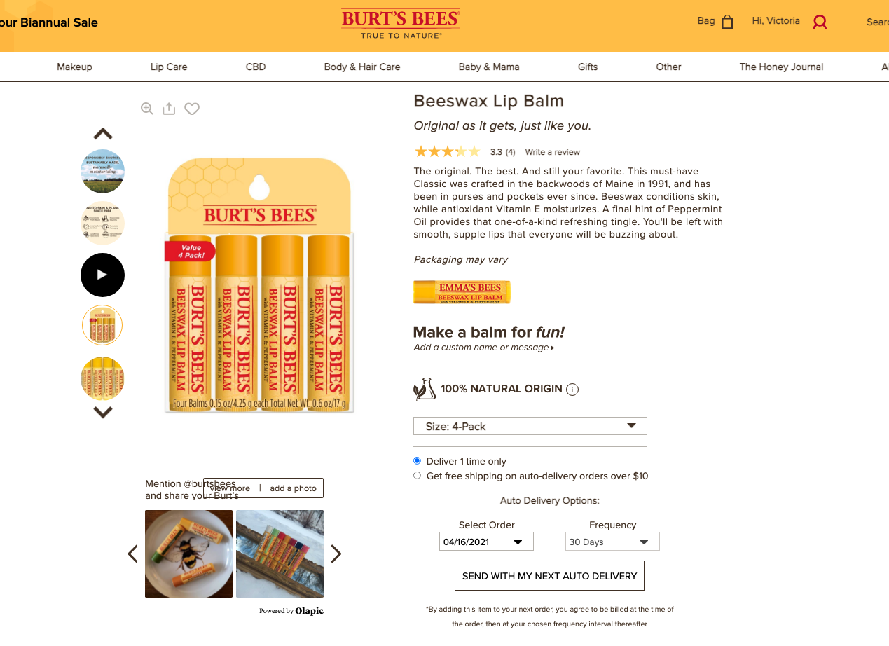 1.0 Page embed — widget as it appeared within a partner site
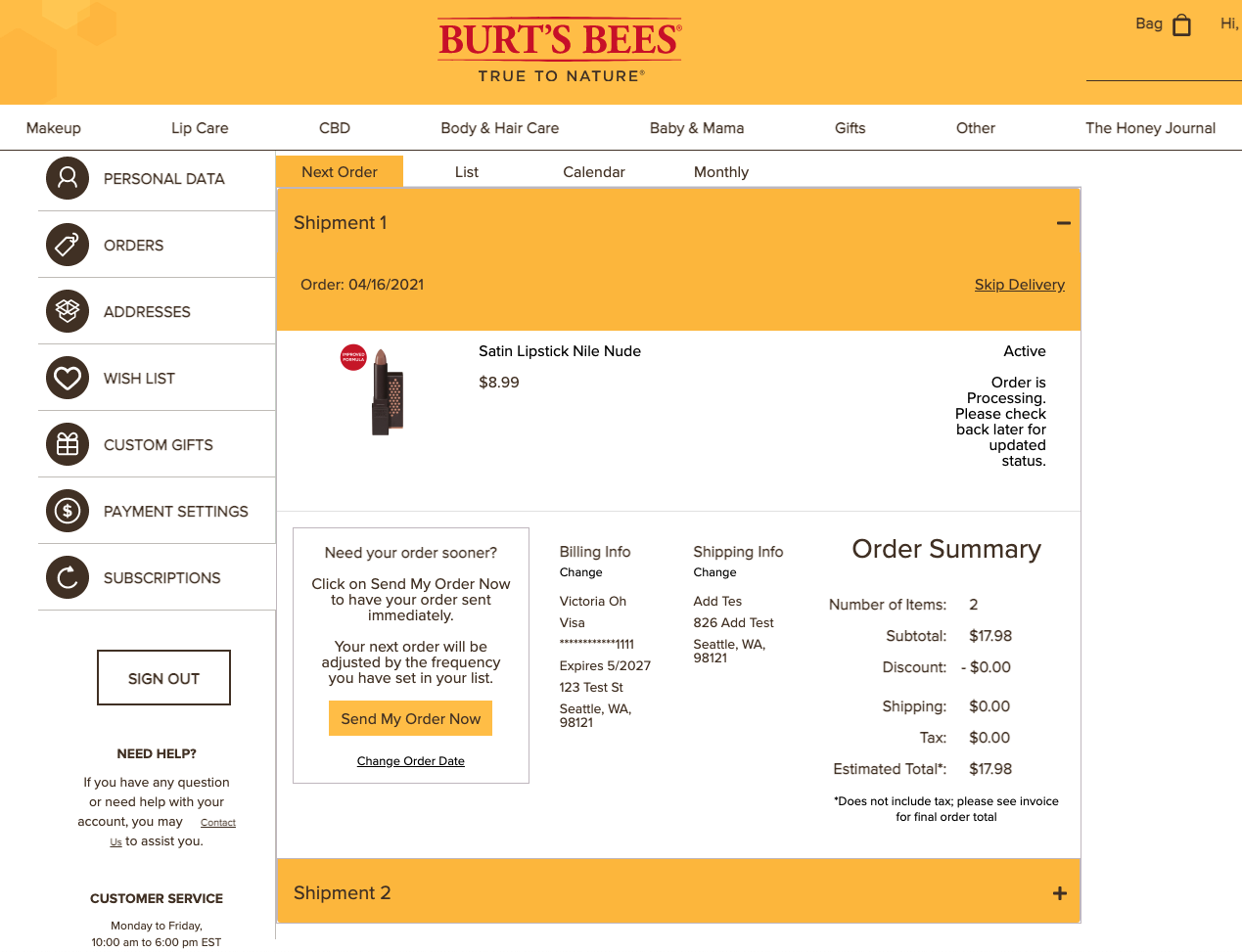 1.0 Order summary — pre-confirmation review screen
Lessons learned from 1.0
| Area | Assessment |
|---|---|
| Visual design | It needed a complete overhaul. |
| Bootstrap | A disaster. The CSS structure broke as soon as I integrated into the first client's site. It also severely limited customization. Layout changes were nearly impossible without rewriting the entire HTML structure. |
| Theming system | Worked perfectly. CSS custom properties let me maintain one codebase and still match each client's colors, fonts, and general look and feel. |
2.0 was a complete rebuild, from design to functional code. I took everything 1.0 had taught me, the data gathered since launch, and worked with the Woodman's design team to rethink it from the ground up.
Visual redesign
The goal was minimal and clean: more whitespace, thinner borders, flatter design, smaller buttons. I worked with the Woodman's designer on the specifics. The constraint throughout was that the widget had to feel like it belonged to each partner's site without requiring custom design work per client.
Major UX changes
Two things changed structurally. The first was the subscription setup flow. In 1.0, users were navigating radio buttons, dropdowns, and CTAs in combination, confusing even for me to explain to someone new. I simplified it to a checkbox and a frequency dropdown, using the partner's existing quantity stepper for item count.
The second change was the cancel button. Previously a user had to navigate into the Manage screen to cancel a replenishment. In 2.0, it's right on the main Items List.
CSS architecture
The biggest change wasn't visual. Bootstrap's behavior when embedded in partner sites was bad enough that the entire CSS architecture needed to go. 2.0 was built on CSS Grid with BEM namespacing to contain the styling. I also implemented shadow DOM to further separate the widget from the partner page. When I layered in CSS custom properties on top of that foundation, the result was much more stable.
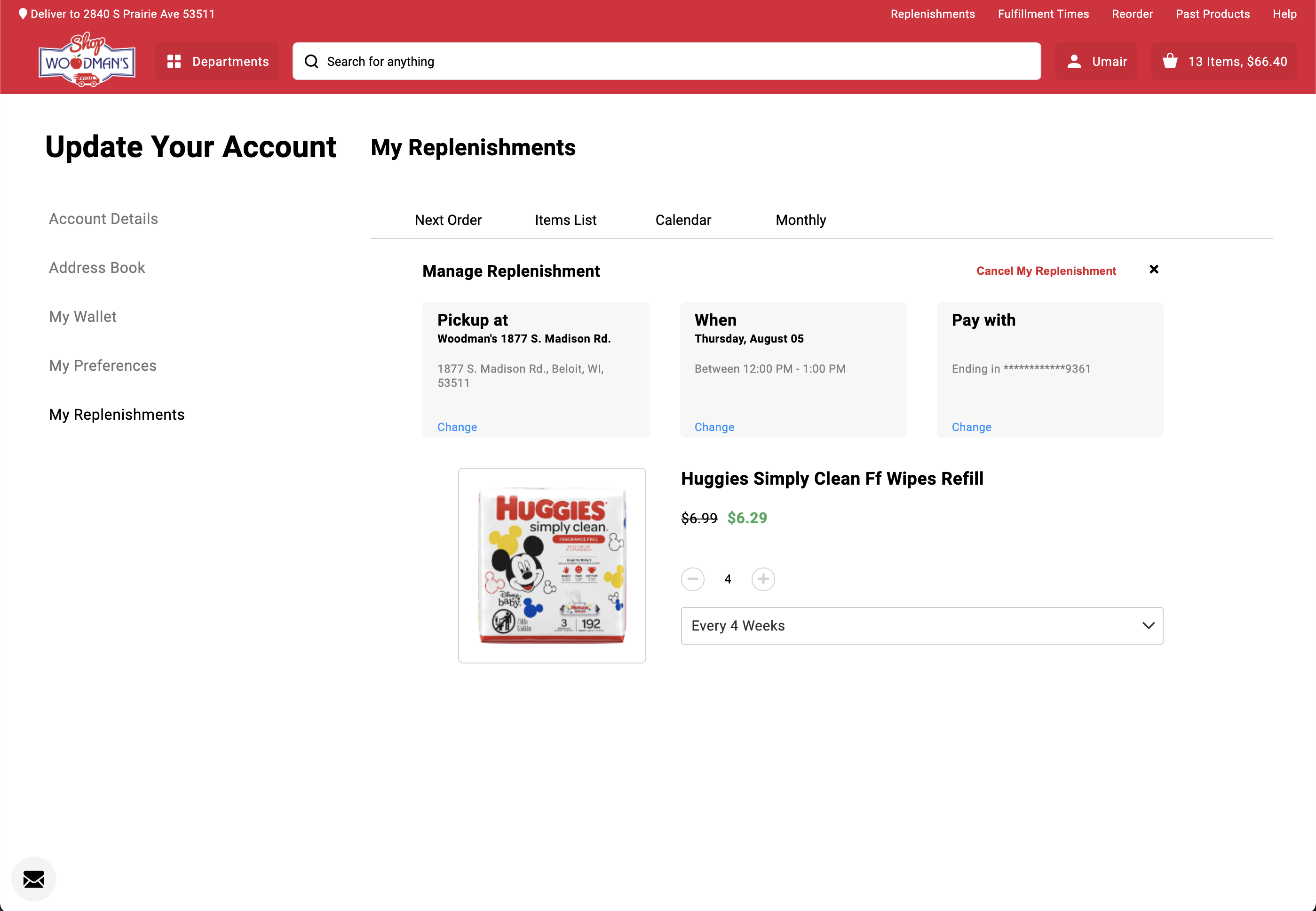 Woodman's theme — manage item view
 Woodman's theme — widget embedded in the partner product page
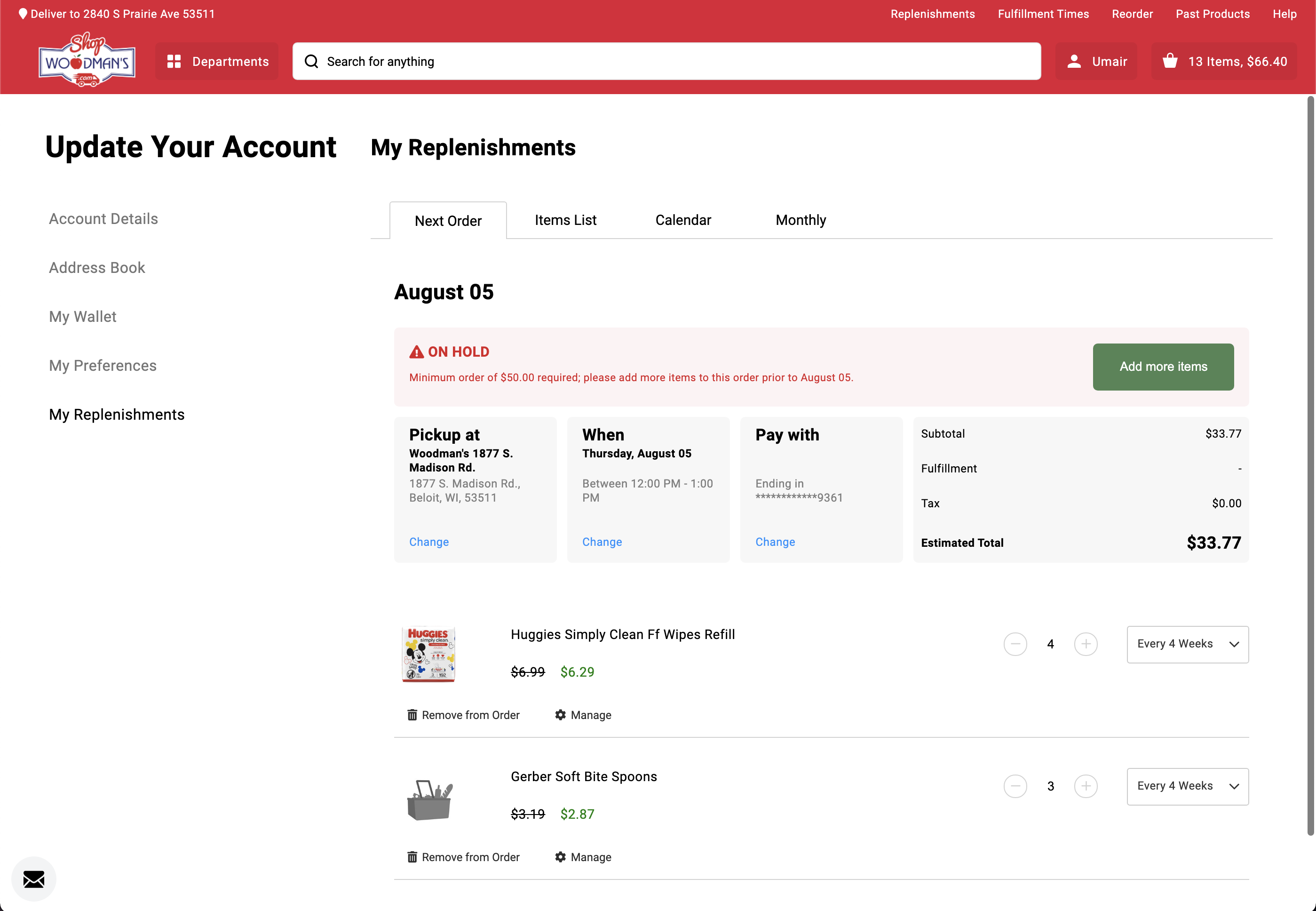 Next order date and frequency control — same codebase, theming handles everything else
One codebase. Multiple brand identities. No fragmentation.
The core problem with having multiple clients was figuring out how to maintain one codebase while letting the widget look completely different on each partner's site. As the person on the team with the most CSS experience, I was responsible for designing the solution, not just the visual output, but the variable structure and the architecture that applied it at runtime.
CSS Custom Properties
Custom properties let me assign every visual property that needed to vary by partner to a single variable. I built a file for each partner's values and applied it using Angular Host Binding. One advantage of this approach is defaults: if a variable isn't loaded for any reason, the default kicks in. The app always looks intentional, and you can tell immediately when something is broken because I designed the defaults specifically to surface problems.
Angular Host Binding
Host binding applied the custom properties at the DOM root. I created a parent class keyed to each partner's channel ID, which cascaded the variables throughout the app.
Theme Directive
Both partners in the screens use exactly the same codebase. Everything visible, font, buttons, layout, is controlled through the custom properties. This became the foundation of Replenium's product and what made adding new partners feasible at scale.
The theming system required thinking like a developer, not just a designer. I designed the variable structure and defaults, not just the visuals.
As I gathered more data and had more conversations with users, I kept iterating on the design. Some functions that had been buried inside other screens got broken out. Some screens that had been separate got combined. I explored a card-based view for subscriptions that would surface more data per item. User feedback on the concept was positive. I left Replenium before it went into production.
 Card system exploration — more data per subscription, not completed before I left
The biggest mistake in 1.0 was choosing Bootstrap without properly pressure-testing what embedding in a foreign CSS environment would look like. We knew we'd be living inside partner sites, but we didn't stress-test that constraint early enough. If I were doing it again, I'd have built a prototype embedded inside a real partner page in week one, not after launch.
The theming system, on the other hand, worked because I understood the technical constraints and designed for them directly. That's the lesson: when you're designing a product that lives inside someone else's product, you can't treat the host environment as someone else's problem.