Designing Spaces for Kubernetes at Scale
The design shipped intact after I left. Spaces became the headline Kubernetes feature of Tanzu Platform 10 at VMware Explore 2024. More than 16 months later, teams are still building on the core without redesigning it. Most portfolio work proves you can design something. This proves you can design something that holds.
I designed every surface end-to-end: the Dashboard, Profiles & Traits catalog, Availability Targets, Create Space flow, Space Detail, and the component system connecting them. I also designed the IaC integration (YAML import/export across all object types) and the dual creation path that serves both UI and programmatic users.
The Broadcom acquisition cut 30% of the team overnight, mid-project, with no handoffs. The design system was rebuilt mid-flight. Space Detail went through six iterations in under twelve months as the product evolved. I navigated all of it without a design manager, realigning with engineering and PM from scratch after the acquisition.
The design shipped intact after I left. Spaces was introduced at VMware Explore Las Vegas in August 2024 as a headline Kubernetes feature of Tanzu Platform 10. Self-managed GA followed November 2024. New capabilities were added through 2025 without rearchitecting the core.
Kubernetes is powerful but relentlessly complex.
App developers had to understand cluster configuration, service binding, network topology, and deployment mechanics just to ship a feature. Platform engineers lacked a structured way to define and distribute standard environments across teams.
Three questions drove the design:
| 01 | How do we reduce developer "time to code" by abstracting Kubernetes and service configuration? |
| 02 | How do we give platform engineers a catalog-driven way to curate services and capabilities for self-service deployment? |
| 03 | How do we make this platform-agnostic, with standardized service onboarding that works across all Tanzu Application Platform functions? |
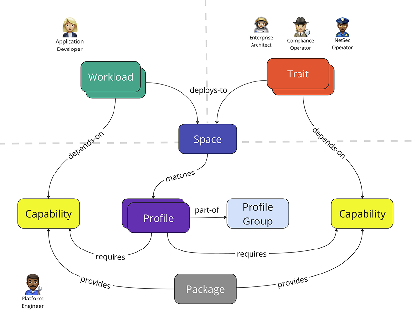 Problem framing — three design questions and the context diagram
Spaces is the nexus of Tanzu Application Platform, bringing together clusters onboarded via Tanzu Mission Control, cost monitoring and observability from Tanzu Hub, services deployed from Tanzu Spring, and the cluster resources and availability targets that keep applications running. The abstraction layer it provides is what lets developers, platform engineers, and SREs each focus on their specialty without stepping on each other. Instead of every role having to understand how every other role works, each person operates according to their own best practices.
I started from the abstraction concept already inside TSM's Global Namespace, simplified it, and extended it to work with any cloud and any set of services. The goal was to let app developers spin up a Space using pre-defined Profiles and Availability Targets that platform engineers and SREs had already built. Developers wouldn't need to know how a Space was configured, just that they could get what they needed and deploy quickly. Profiles and their accompanying Traits and Capabilities let platform engineers manage the building blocks at an object-oriented level while still supporting fast, flexible self-service for developers on the other side. Availability Targets define the rules for how a Space gets scheduled onto available clusters.
I also wanted to integrate Infrastructure as Code so platform teams could version-control Profiles and Traits in git repos and share configurations across teams. Users can upload YAML files instead of going through the UI stepper.
 Abstraction model — Spaces, Profiles, Traits, and Availability Targets as a layered hierarchy
Three iterations toward a health view
| Iteration | Trigger | Change | Outcome |
|---|---|---|---|
| First | No clear trigger. Borrowed patterns from Secure App IX and TSM inventory grid. | Showed everything: Compliance, Capabilities, Languages. High information density. | Became too data-dense; approaching a detail page rather than an overview. |
| Second | Engineering and PM reviews flagged density as a usability problem. | Refined requirements; still displayed languages and environments. | Broadcom acquisition paused work before further testing. |
| Final | Post-acquisition, composition attributes had moved into Profiles and Traits, making earlier layout redundant. | Became a high-level health view. Introduced interactive status badge from TSM Global Namespace. | Clicking the badge opens a status panel without requiring a detail page visit. |
The interactive status badge came from TSM's Global Namespace, where it had gotten strong user feedback. The TSM user base was the primary audience for Spaces, so reusing a pattern they already knew was deliberate, not a shortcut. The same component, surfacing similar health information, in a familiar interaction model.
 First iteration — high information density, approaching a detail page
 Final iteration — scope refined after acquisition
 Final state — health-focused overview with interactive status badge
I established the catalog pattern early and reused it deliberately across Profiles, Traits, and Availability Targets. The goal was a consistent interaction model so users wouldn't have to relearn how to navigate each new object type. Each surface after the first cost less to design and less time for users to pick up.
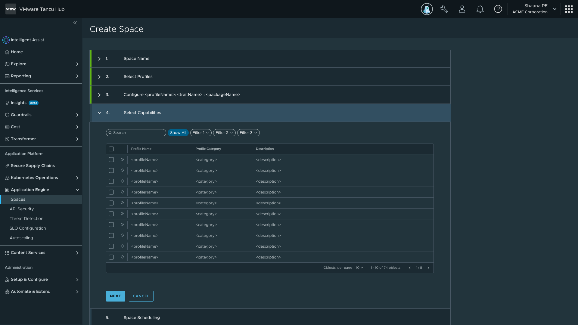
Profiles are made of Traits, which are made of Capabilities. Traits are collections of Kubernetes resources deployed into a Space on creation; Capabilities define the individual functions those Traits expose. I designed two creation paths for each: a guided UI stepper for users new to the platform, and a YAML file import for power users and IaC workflows. Both paths produce the same artifact, so there's no capability gap between them.
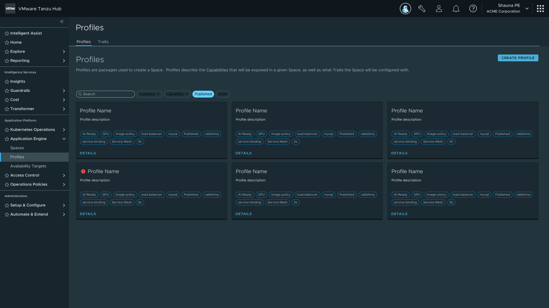 Profiles catalog — the same list pattern used for Traits and Availability Targets
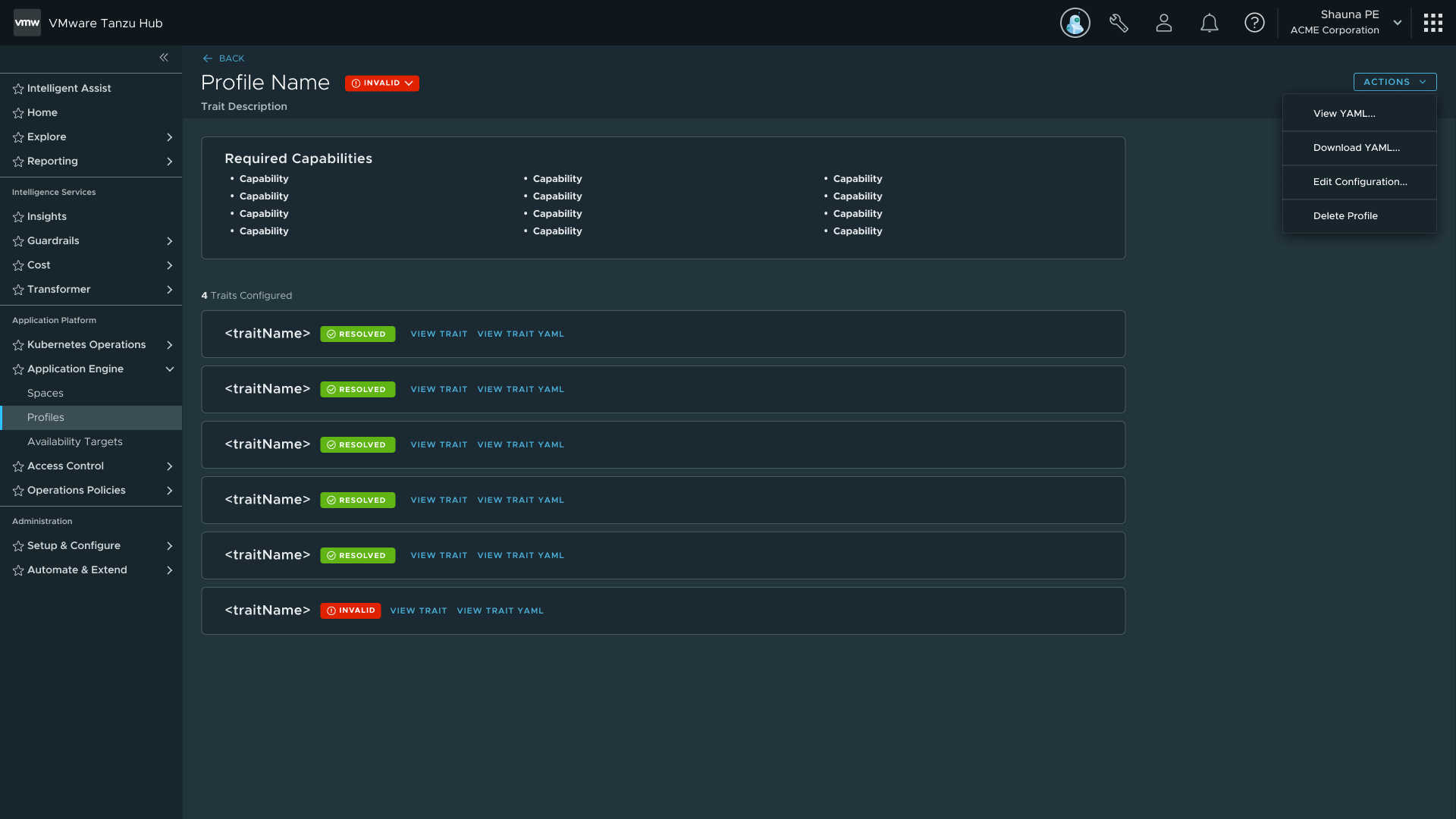 Profile detail — capabilities, traits, and configuration; foundation for the Spaces detail pages
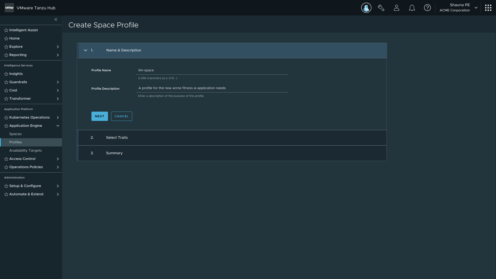 Guided stepper — for users new to the platform
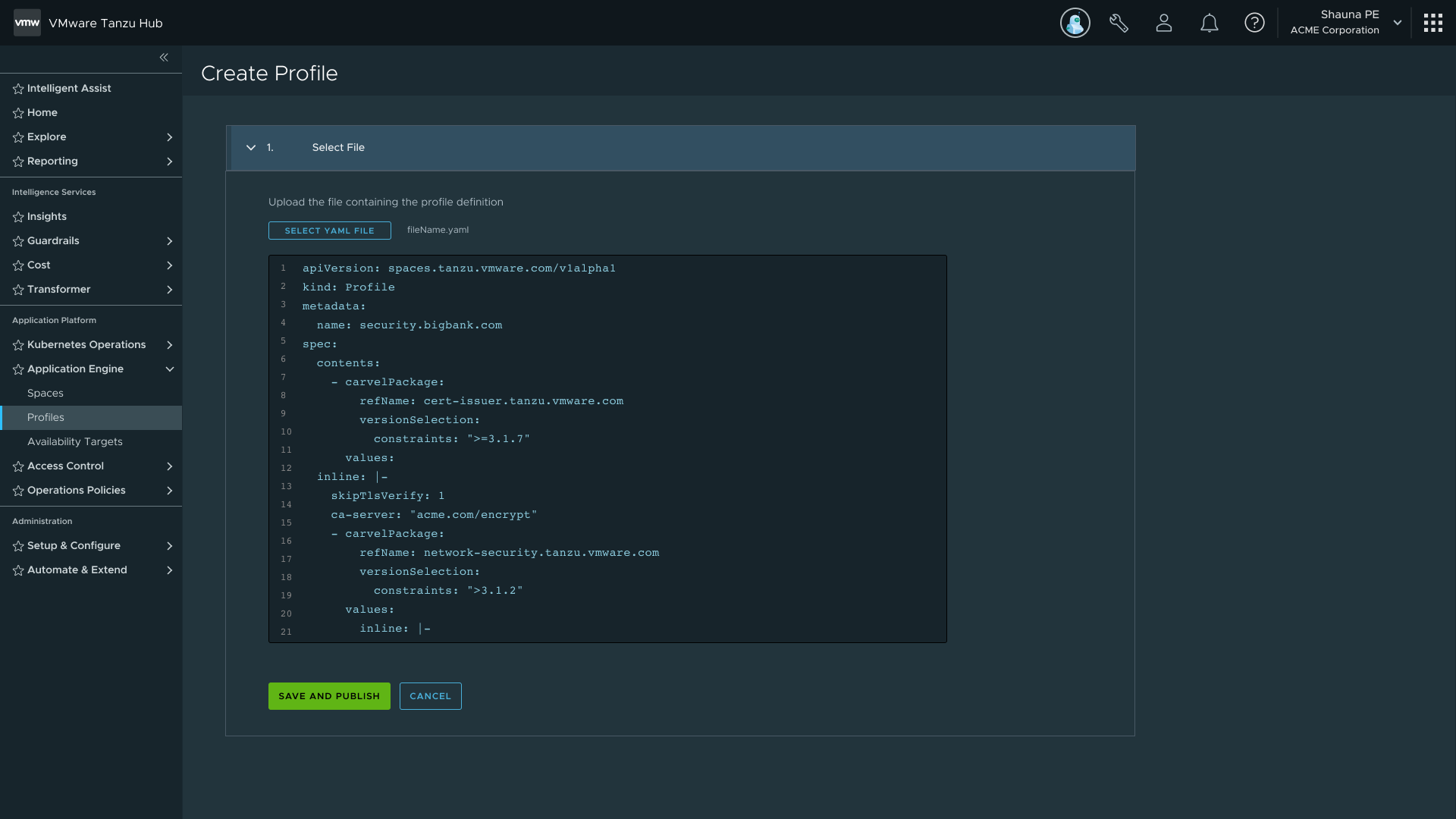 YAML upload — for power users and IaC workflows; same artifact, no capability gap
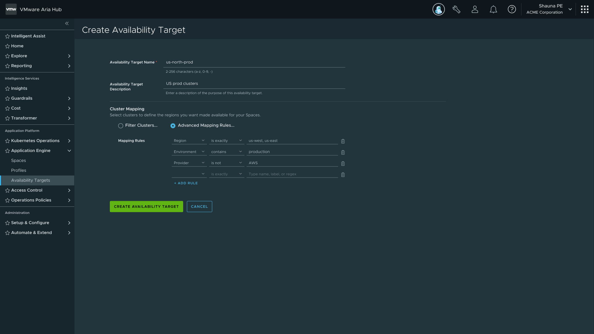
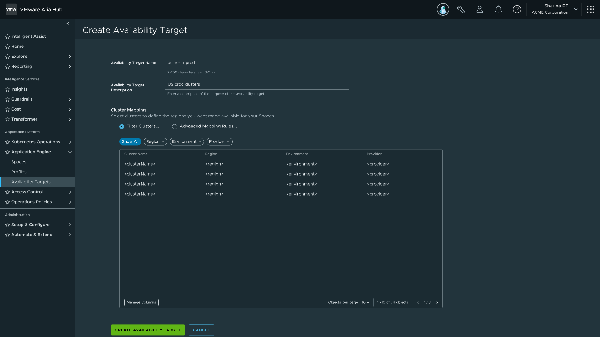
Availability Targets introduced Space Scheduling. Rather than assigning a Space to specific clusters, a Space references one or more Availability Targets that define a pool of clusters. The Application Engine runs a multi-tier filtering algorithm that mirrors how Kubernetes schedules pods onto nodes.
| Approach | Behavior | Tradeoff |
|---|---|---|
| Specific Cluster Assignment | Familiar from TSM and TMC. If a cluster goes down, the Space goes with it. | Requires manual monitoring and intervention. Higher operational burden. |
| Mapping Rules (recommended) | Backend automatically finds a new matching cluster if the current one fails. | Allows manifest-driven or rules-based environment creation. Lower ongoing burden. |
Both options shipped, but the UI nudges users toward mapping rules. Two decisions I specifically advocated for: exclusion operators and cluster preview.
On exclusion: include-only rules force users to enumerate every valid option. With "is not" and "does not exist" operators, you describe the exception instead of the exhaustive list. That's a meaningful reduction in configuration burden for anyone managing a large cluster pool.
On preview: before committing to an Availability Target, users can see which clusters will match their mapping rules. It closes the feedback loop and cuts trial-and-error when the conditions are complex.
 Rule builder — field, operator, value with include/exclude support
 Cluster preview — live mapping of which clusters match the current rules
 Availability Target selection during Space creation — scheduling via mapping rules or specific cluster
The create flow generated more internal debate than any other surface on the project. The core tension: how to let users configure a Space while keeping the process simple and avoiding click-ops.
| Iteration | Trigger | Change | Outcome |
|---|---|---|---|
| First | Initial assumption: users needed explicit control over environments and language support per Space. | Users could configure specific environments and languages per Space. | Couldn't support multiple languages in one Space. Configuration moved into Profiles. |
| Second | Research showed PE users strongly preferred YAML upload over stepping through guided screens. | Added file uploader as separate entry point. Introduced Space Scheduling. | Bifurcated path validated with internal dev teams. |
| Third | Editable Profile fields needed to surface at Space creation time. | Conditional stepper introduced. Availability Targets formally introduced to Space Scheduling. | Standalone Capabilities per Space was explored and cut. |
| Fourth | Team debated splitting Create Space into two persona-based flows. | Evaluated split vs unified approach. Unified flow won. | Splitting creates two codepaths and confuses users who wear both hats. |
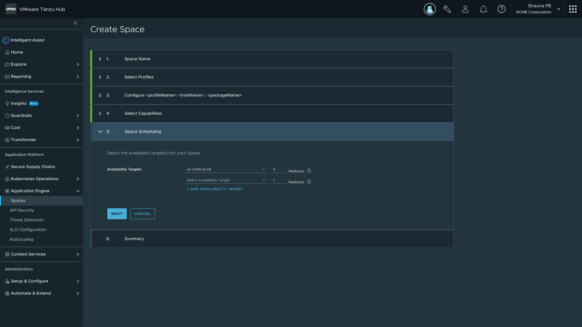
| Final | All prior iteration learning synthesised into a stable, reviewable flow. | Four primary steps: Space Name, Select Profiles, Space Scheduling, Summary. Summary screen fully editable. | Flow is simple because complexity was moved upstream into Profiles and Availability Targets. |
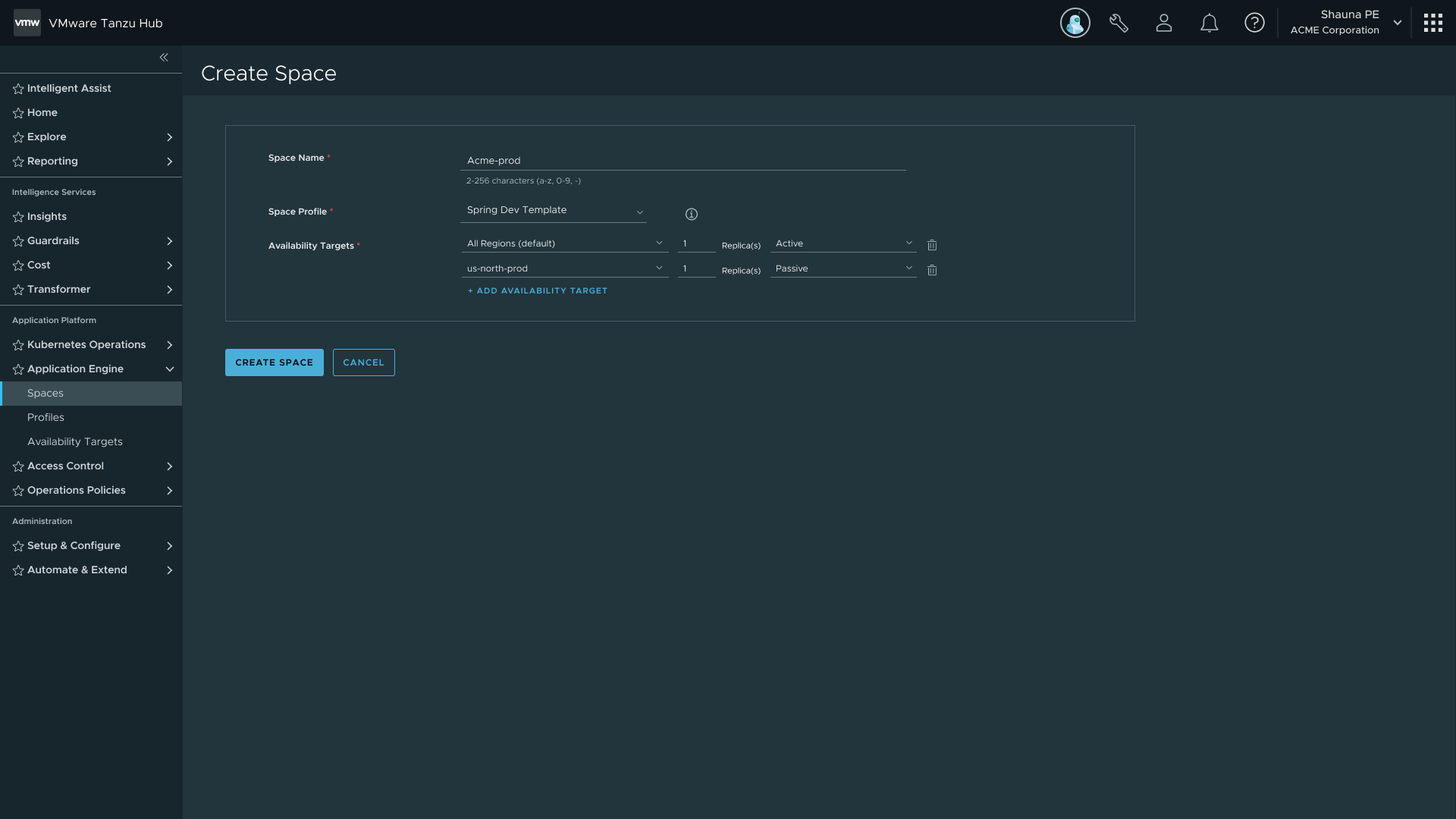 Final Create Space flow — Name, Select Profiles, Space Scheduling, Summary
 Profile selection step — complexity moved upstream so the flow stays simple
Space Detail is the most iterated screen in the project, with six iterations in under twelve months.
| Iteration | Trigger | Change | Outcome |
|---|---|---|---|
| First | Requirements still being refined. | Simple topology view with tabs for Services, Policies, Configuration. | Functional baseline, underspecified by design. |
| Second | Users in internal reviews consistently asked which clusters their services were assigned to. | New topology with hover-to-highlight interactions. Cluster boundaries added. | Users could understand which clusters their services were running on. |
| Third | TSM research flagged that checking Space health meant navigating away entirely. | Added interactive Status badge and side popout for in-context service inspection. | Badge opens a status panel inline, no navigation required. |
| Fourth | In-context service datagrid had tested well at small scale in TSM. | Placed service datagrids directly beneath the topology. | It broke at scale. The datagrid pushed the topology above the fold. Services went back to a tab. |
| Fifth | Developers were leaving the platform entirely to check service health. | Added Observability tab with Performance, Security, Workloads, and Logs visualisations. | Users could check baseline service health without leaving the platform. |
| Final | Backend requirements for log streaming were not finalised before the release window. | Logs cut as a deliberate quality call. Charts, popout, and datagrids retained. | Infrastructure kept intact so logs could be added later without rework. |
 Iteration 2 — topology with hover-to-highlight and cluster boundaries
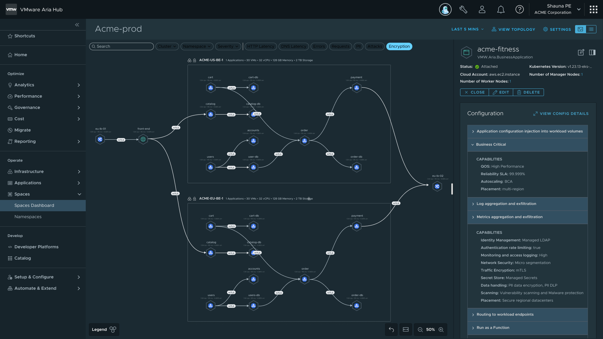
 Topology final — cluster assignments visible, status badge inline
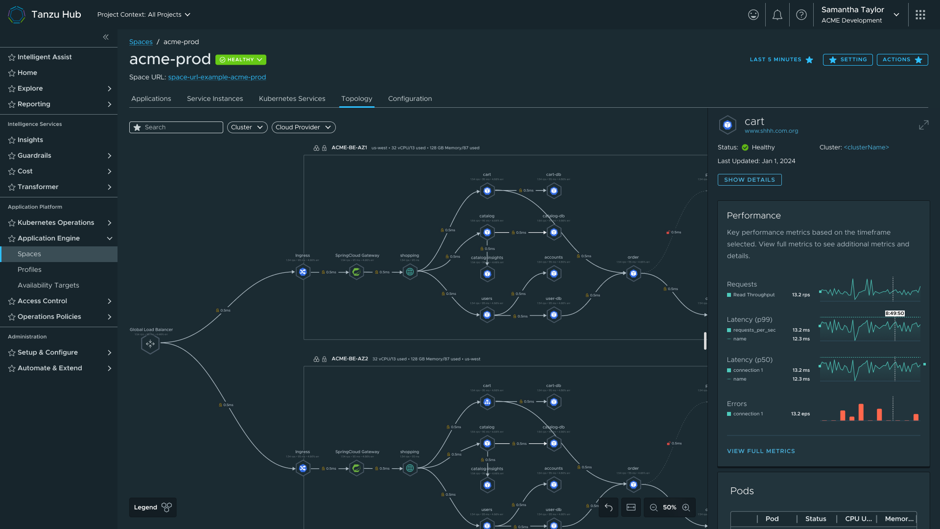 Space Detail final — full view with topology, observability tab, and services
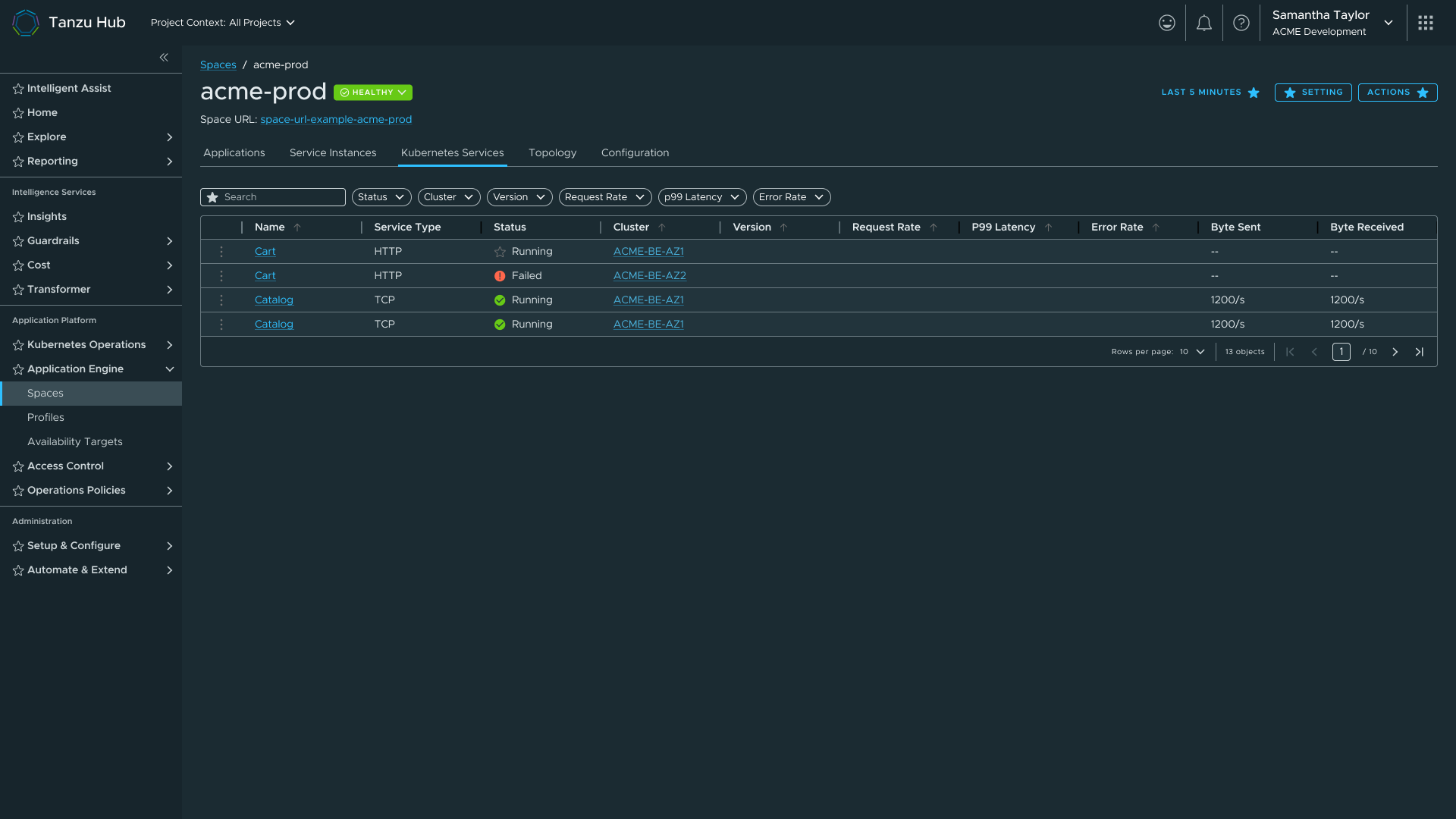 K8s services tab — datagrid moved back to a tab after failing at scale inline
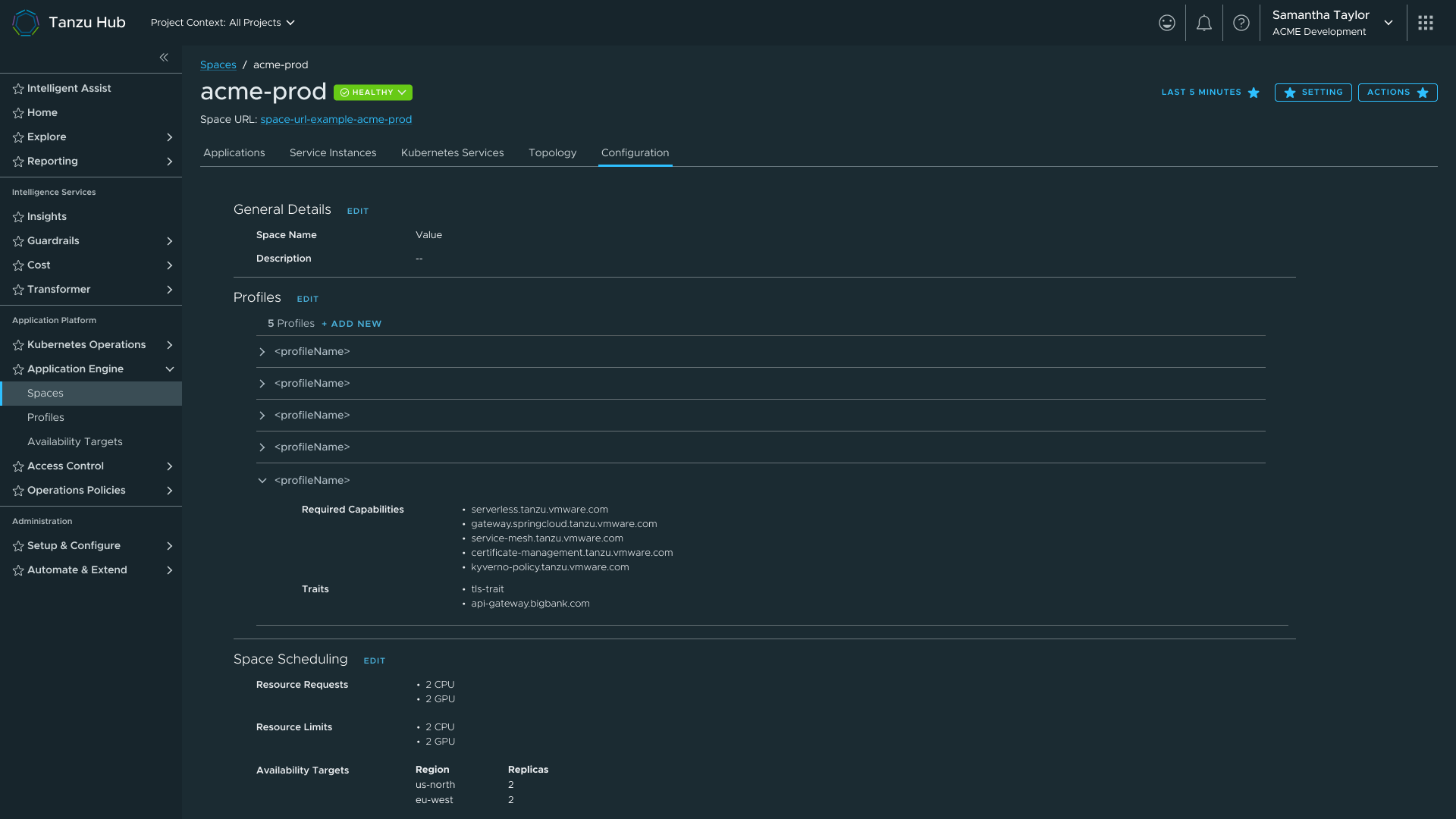 Configuration view — Profiles, Traits, and Availability Targets linked from the Space
Key design decisions - Space Detail
Side popout over new page
Users needed to inspect a service in detail without losing their place in the topology. Navigating away breaks the spatial context that makes the topology useful. I ported a side popout pattern from Aria that kept both views alive simultaneously.
The observability boundary, and holding it
The team formally agreed we were not building an observability tool. When PM pushed for more features, the boundary held, not because I said no, but because we had a named principle and a deferral strategy. Features went into the backlog with infrastructure already in place.
Deferring logs as a quality call
Cutting a feature before launch rather than shipping it incomplete is a decision most designers don't own. I advocated for the cut because I understood the system well enough to know what was safe to remove.
The fourth iteration failure
The datagrid-beneath-topology pattern didn't fail because I hadn't thought it through. It failed because the problem only becomes visible at real data volumes. The lesson: contextual proximity only works when the context stays visible.
Status badge reuse, with intentionality
The TSM status badge earned positive feedback because it gave users a fast health read without forcing navigation. The reuse was deliberate: same user need, same interaction model, familiar pattern for a TSM user base that was the primary audience for Spaces.
| Challenge | What I did |
|---|---|
| 30% team loss overnight (Broadcom acquisition) | Inherited projects with no background documentation. Established design continuity through HLD/LLD document reviews and a PM sync cadence. |
| Design system in transition | Clarity stopped accepting outside submissions post-acquisition. Continued on Clarity with a documented migration plan; flagged inconsistencies for future sprint. |
| Angular vs React fragmentation | Established shared component reuse patterns and a cohesive interaction language despite framework fragmentation. |
| Scope creep via engineering changes | After acquisition, engineering paused dashboard work to rebuild capabilities. Ran multiple rounds of syncs with engineering and PM, and read HLD/LLD documents, before design proceeded. |
| Outcome | Detail |
|---|---|
| Consistent Component System | The catalog + creation pattern established for Profiles was reused verbatim for Traits and Availability Targets. Each successive surface cost less to design and less for users to learn. |
| Automated Cluster Failover | Availability Targets paired with Application Engine's continuous scheduling loop eliminated manual cluster intervention. |
| IaC Integration at Scale | YAML import/export across all object types gave enterprise platform teams version control, cross-team sharing, and programmatic management. |
| TSM User Continuity | Reusing TSM patterns meant existing users could orient immediately in a new product. Familiarity was a deliberate design choice, not a shortcut. |
| Delivered Under Compression | Six surfaces designed and iterated, a component system established across three object types, a design system rebuilt mid-project, 30% of the team lost overnight, and a major acquisition navigated, in under twelve months. |
If I were starting Spaces today, I'd push for a formal research repository from day one. The TSM status badge reuse worked because we had prior user data to lean on. More structured research, earlier, would have shortened several iteration cycles.
I'd also instrument the product earlier for measurable outcomes. The design decisions I made are defensible on reasoning, but I can't point to a time-to-deploy improvement or a support ticket reduction. That data exists in Broadcom's systems. I didn't own it before I left, but I'd design the measurement into the work from the start next time.